Cohost Media
Service: Visual Brand Identity Design
Year: 2024
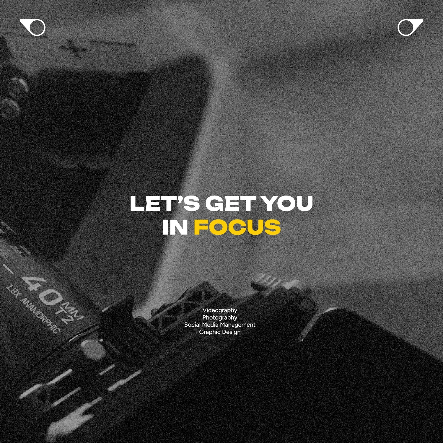
Cohost prioritizes collaboration, working closely with clients to keep them center stage - Host - while providing support discretely from behind the scenes - Cohost. This partnership ensures clients always capture the spotlight, with cohost media as their committed ally. They offer photography, videography, graphic design, and strategic social media management, meant to elevate client engagement seamlessly. Founded by Alex, who was driven by a desire to break free from conventional job roles, Cohost Media thrives on the joy of helping clients achieve their dreams. As a beacon of growth and quality, Cohost is committed to building lasting relationships and turning professional interactions into lasting partnerships and familial bonds.
The Idea
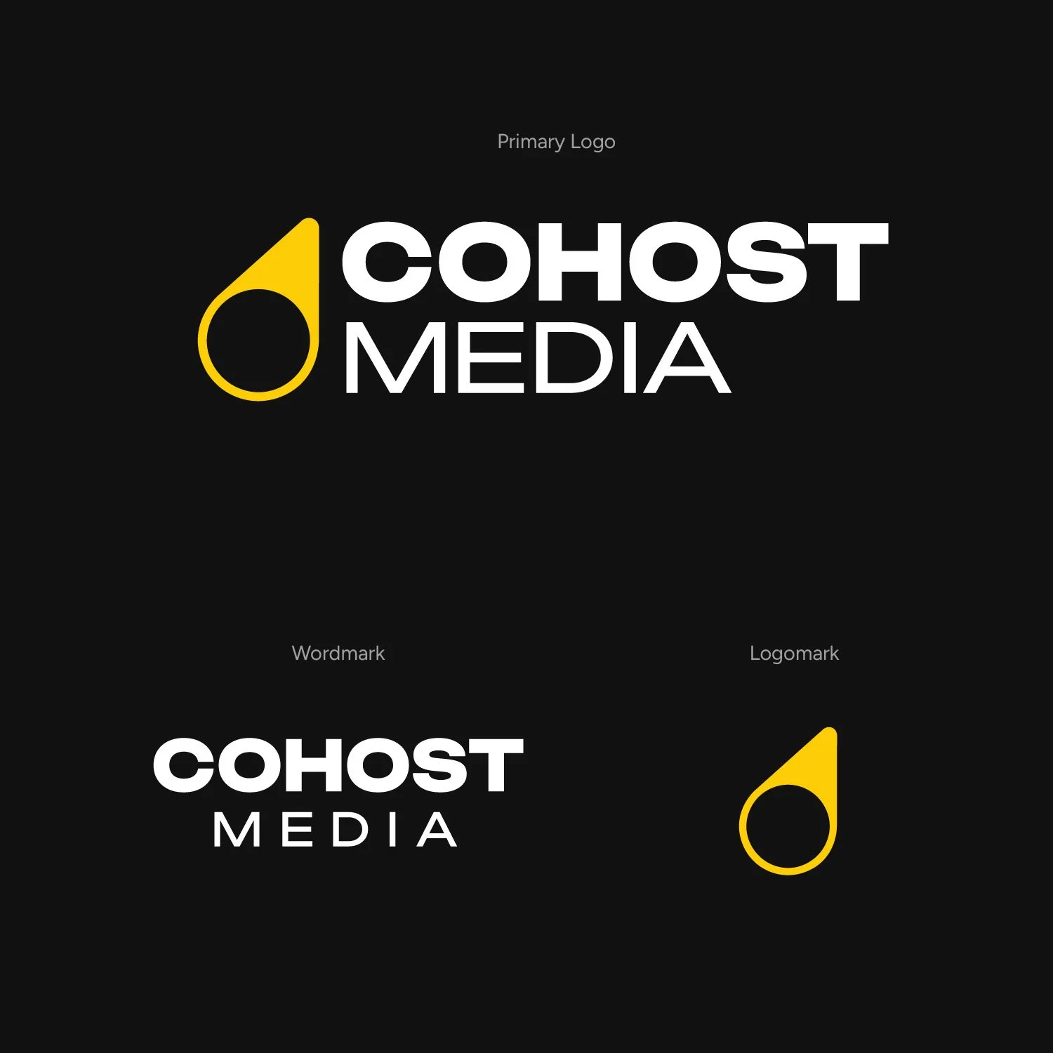
The meaning behind the name Cohost was so strong, that I couldn’t help but lean into the idea of incorporating a spotlight into the final design. After experimenting with a plethora of spotlight ideas (sketches at the top of the page), I had a tough time meeting the requirements of a minimal spotlight design without it feeling uninteresting. Alex made it evident that he wanted his design to be extremely minimal with little detail. Referring back to my sketches, if you look at the top right sketch (that looks like a fidget spinner haha), there was potential there, but I couldn’t shake the idea that it looked like a fidget spinner. After some collaborative back-and-forth feedback with Alex, we took out ¾ spotlights and were left with just one. After tweaking its placement and angle, we finalized the design, which aligned with the minimal yet meaningful idea Alex had envisioned.
The Visual Identity
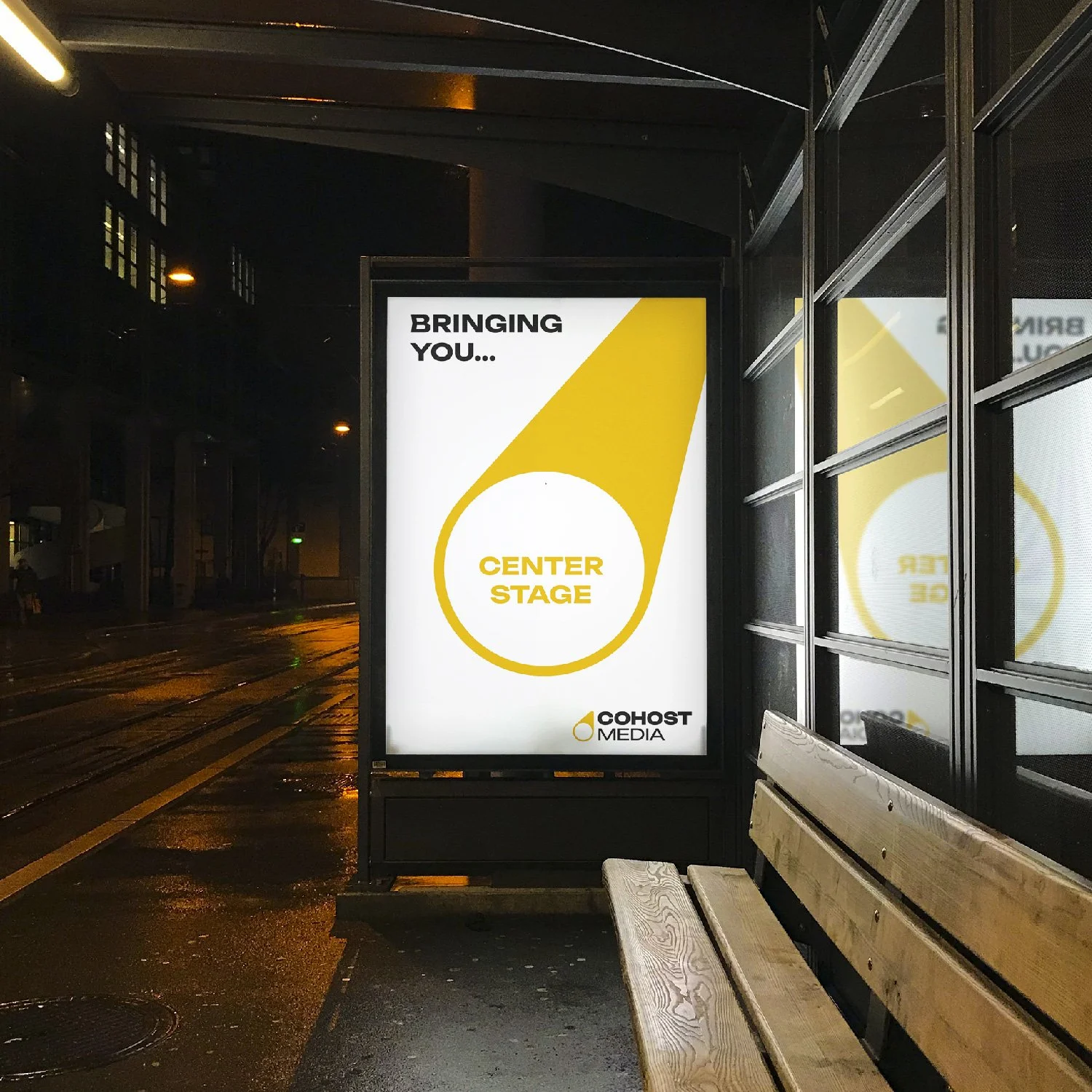
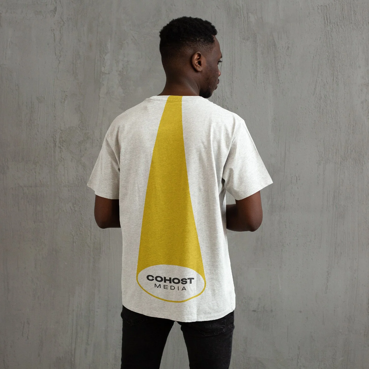
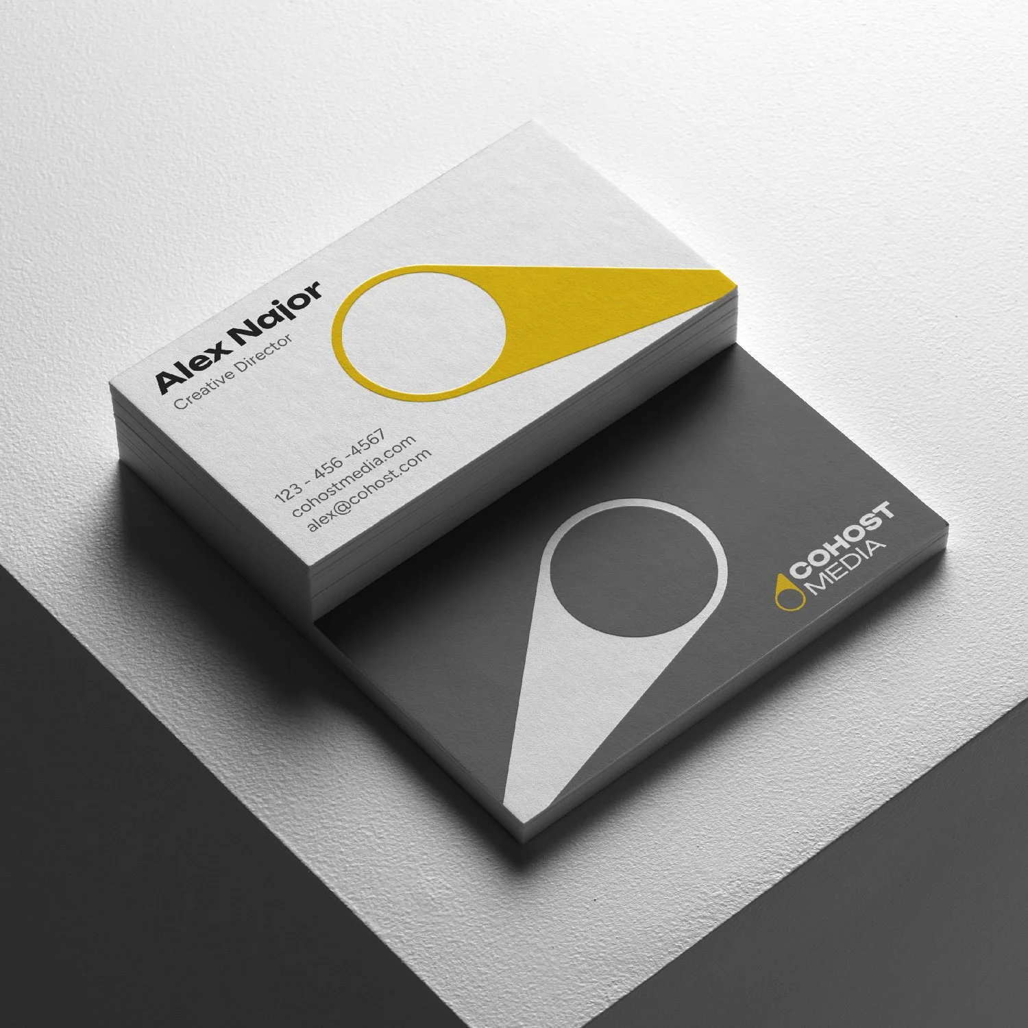
When designing a minimalistic visual identity, it’s difficult to differentiate the brand with the color palette and typography alone. Cohost required a distinctive visual element that could unify the brand and call back to the original logo. Since the logomark is a spotlight, I thought of manipulating its shape, by distorting, rotating, and stretching the spotlight (while maintaining the shape of the circle). This adaptation allows the spotlight to be versatile across various applications, such as marketing materials and merchandise, while feeling connected to the logomark. It can also be used in an animated application with the spotlight moving across different parts of the screen revealing different text and images. This idea brought Cohosts identity to life and truly separated them within their industry.
Testimonial
“I was extremely happy working with Vincent and with the whole process. It took some time, but he was super understanding and wanted to make sure I was happy with the result. I was very happy with what he made me, and I can't wait for everyone to see it. I highly recommend using him for all logo needs.”
- Alex Najor


